I worked on the UX/UI and brand identity for Picbag, a visual organization app at prototype stage.
Picbag lets users collect inspiration, intelligently tag and sort photos and image snippets, and create moodboards they can share.


Research
One of the first steps was to identify who are the target users, and then understand how this app can help them achieve their goals.
Using Google Forms, I ran an online user survey with my contacts from the startup scene in London, with a focus on product requirements (app features). I aggregated the responses, calculated the ‘value’ and ‘effort’ attributes for each entry and populated a feature prioritization 2×2 matrix.
Design process
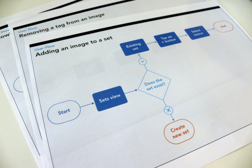
I mapped the path a user would follow to complete specific actions, and exported such diagram to break down the whole system to individual, recurring interactions.

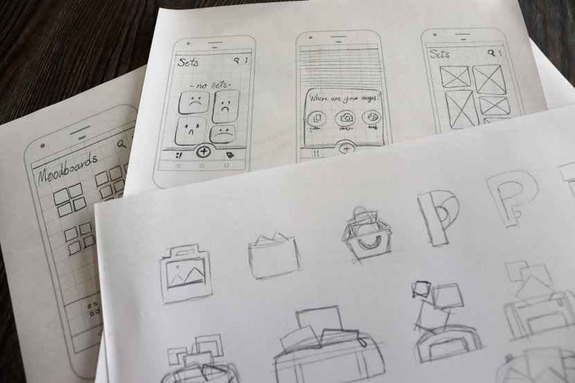
I sketched the app screens wireframes with pencil and paper, to quickly test different ideas and hierarchies and to create a library of reference layouts for later use.

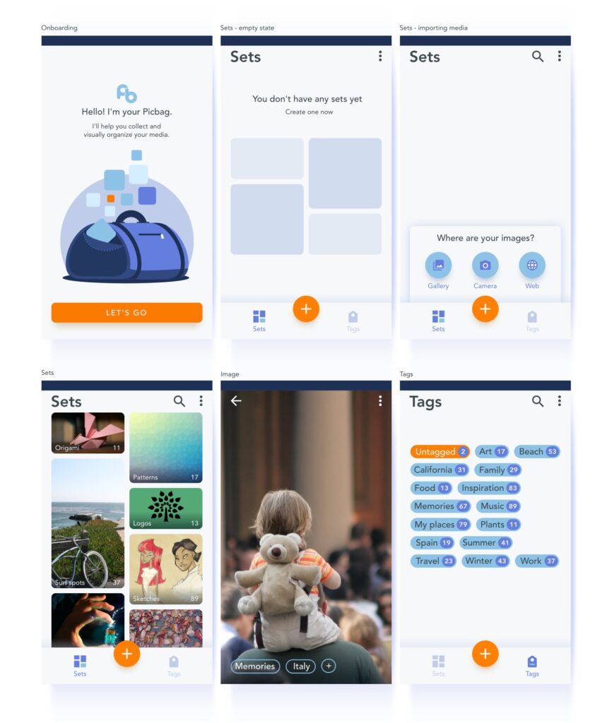
The design did go through a few iterations, inspired by user feedback.
I didn’t want to spend too much time on the branding aspect of the project, since it’s still a prototype and some key decisions about the development have not been made yet, such as what platforms the app will be deployed to and what tools will be used. This ambiguity is reflected in the prototype theme, where I mixed components of iOS design and design patterns for Android. This will change once the brief will become clearer.

