I don’t play video games anymore, but I’ve always been fascinated by their hybrid nature, crossing artistic expression and a constant push for technical evolution.
When I was a kid and the Commodore 64 was popular, game making had just become accessible to everyone.
Now that the video game industry is larger than all the other entertainment industries combined, games contain universes, and spending time making a small game might feel pointless. However, these days ‘indie’ game development is thriving, its community is very active, and the resources required do make a game by yourself are freely available online.
I can make things move on a screen, tell the computer what to do, make it beep.
And I had a story to tell. A journey that’s emotional, profound, dramatic, and darkly mysterious.
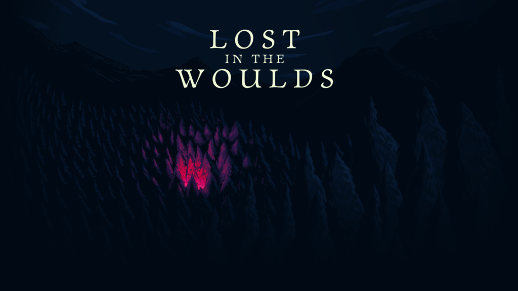
Artwork
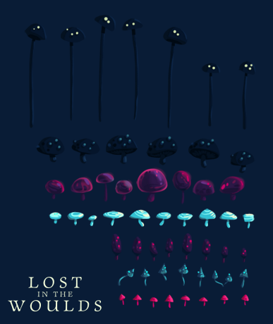
I first worked on the visual development of plants, grass, tree trunks, mushrooms.
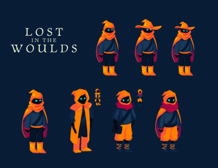
I then spent some time thinking what look would work for the main character. I wanted the player to be somewhat undefined, a figure with no racial or age features, and even gender-less.
The walk animation is hand-drawn, frame by frame. To let the character face the opposite direction I could have simply reused and flipped the same graphics, but that would have made the shadows look wrong, so I copied only the base layer of the body and drew a new walk cycle on top.
Plants are animated if touched by the player. Under the hood, each plant is draw in a ‘quad’, a quadrilateral texture whose geometry is dynamically calculated. The quad’s geometry gets distorted when it overlaps the player, based on the direction the player is walking along, to give the effect that the player is pushing the plant.
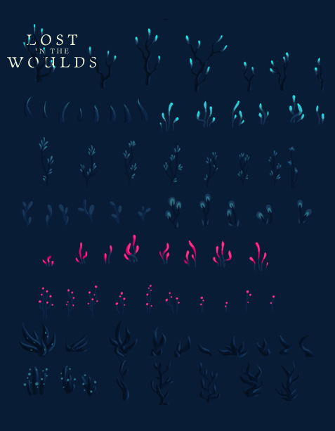
Graphic assets are arranged in spritesheets, a way to pack multiple related graphics into single image files, for various performance reasons.
I composed and played the music for the main menu and for the actual game theme. I used Ardour and a few software synthesizers, including amsynth, for which I created a visual interface some time ago.
Level design and game maps
The tool used to assemble all the graphic assets into level maps is called Tiled. It gives every instance of an object an x and y position, allows to arrange objects creatively and to assign them specific properties. For example, the player can walk through a bush but not through a tree stub, because of a collide property assigned to it.
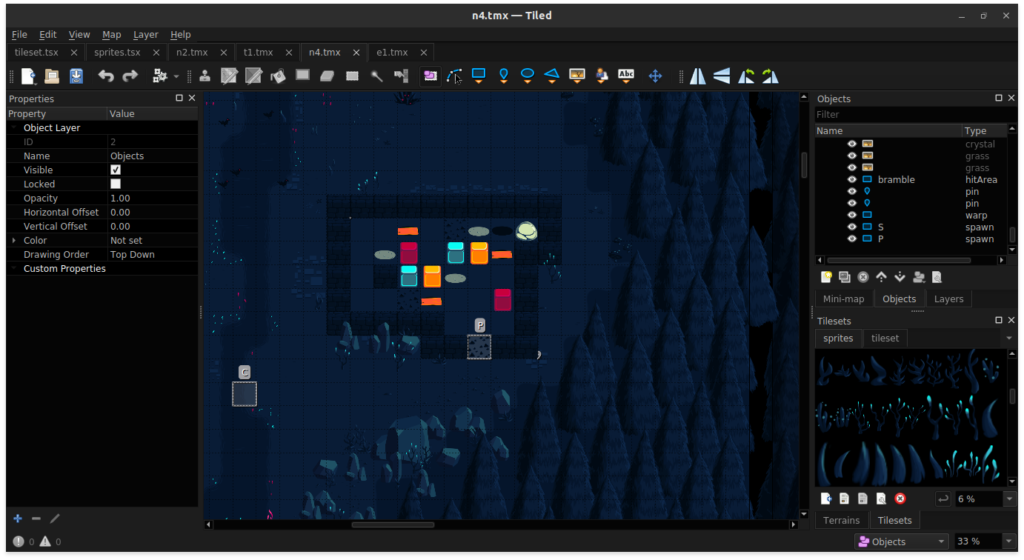
Tiled needs a tileset, an image structured in a grid of repeatable square tiles, mostly to represent terrains like grass, mud, pebbles and so on. Each terrain requires several tiles, creating variety to avoid aesthetically unpleasing repetitions or blocky transitions between one terrain and another.
I had to plot a dependency chart to decide where to physically place items on the map, where the roadblocks are, what can be reached first and where are the warps (portals) from one stage to the spawn points in another one. If I hadn’t done so, I could have accidentally placed an object that unlocks a specific area into the area itself. Just like locking your car keys into the trunk!
User Interface and input
Pausing the game shows a minimap, the map of all the available stages, color-coded to tell apart the ones with an unsolved puzzle, the ones that have been cleared and the ones that have not yet been visited.
There’s a counter on the top left of the screen that displays how many items are left to collect. I initially made the mistake to keep that information hidden away on the pause screen, but a tester rightfully pointed out that a player might want to have that always visible.
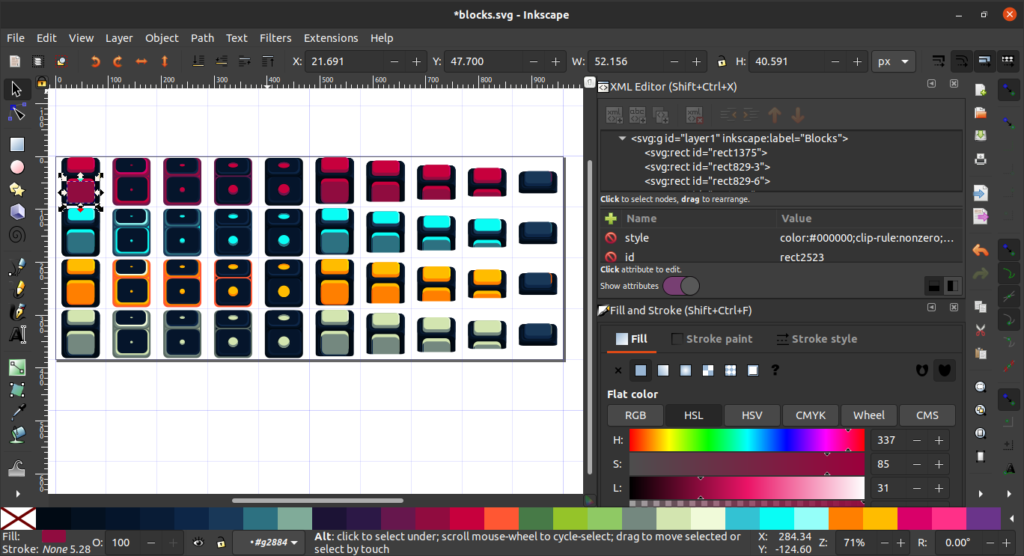
I designed the map layout as an SVG file in Inkscape, and then wrote a small script to convert the x, y and size data to a format that the game engine could use to redraw the map correctly every time the pause screen is displayed.
I created a menu system that allows menus, sub-menus, simple buttons, on/off buttons, metered buttons (like the brightness level button).
Buttons react to mouse clicks, finger taps, keyboard input, gamepad button presses. Selected buttons change tint and show an animated clue, to help with accessibility.
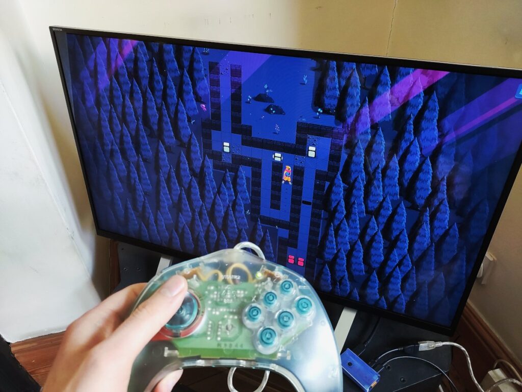
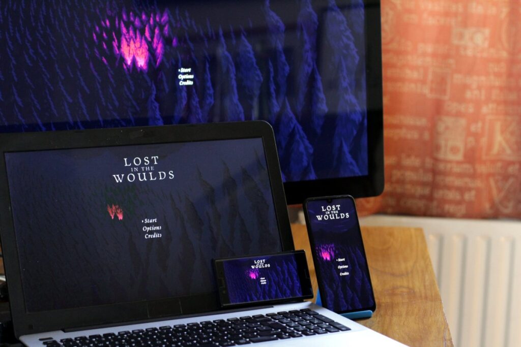
The game can be played using a keyboard (it works with the standard WASD layout and with the less common ZQSD. De rien !) Also, it can be played by swiping on a smartphone, or using just a mouse, and it even supports generic gamepads!
The code that controls the character is also responsible for validating the moves – like, so you can’t walk through walls or push bricks where they shouldn’t go.
Locales and caption system
The game is currently localized in four different languages: English, Italian, Spanish, Catalan. I have plans to add German, Swedish, French and Japanese later on.
I wrote my own Python parser to convert the comma-separated values spreadsheets I sent to the translators into the JSON format that the game can load. My code automatically picks up the language of the device in use, if available.
The puzzles
Lost in the Woulds is a top-down puzzle platformer. The movements of the player are aligned to a grid, and the core mechanic is to push blocks out of your way. Some blocks are quantum entangled: when one is active, their ‘twin’ is not. Moving a block deactivates it, but activates its twin.
Puzzles also have holes that can be filled by pushing a block into them, planks that crack after they’ve been stepped on, grit that limits the movement of the blocks, sand pits that completely restrain blocks, cracks that open up after a block has been pushed on them. Another unique feature of this game is what I called Qflows, or quantic flows.
Playing a difficult puzzle game can be a frustrating experience if there’s no way to backtrack. So I implemented an undo system that keeps a stack of all the steps the player made, along with the information of where the each game element was and what was its state, so the player can restore previous states, stepping back one move at a time.
To design the puzzles I had to create my own in-game visual editor. It turned out pretty neat. It allowed me to drag and drop puzzle elements on the stage, and most importantly to preview puzzles on the fly.
Code
The game framework I used is Phaser 3. I chose it mainly for its rendering abilities, but it also helped with particle generation, overlap detection, camera, the management of sound, input, state… and much more, really.
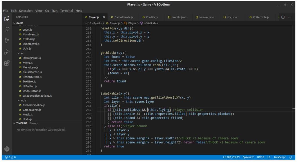
The game is entirely written in JavaScript, with small portions being GLSL shaders. My development environment consists in VSCodium as the editor, NodeJS and NPM for the various utilities needed for automation and asset packing (gulp, spritesmith, tile-extruder, audiosprite), Cordova to build the Android version, plus numerous custom shell and python scripts. All running on gnu/linux.
For some time I used a local Git repository to keep track of all the changes, but then I realized that there’s only one code branch, I never revert to a previous state, and so I started simply using rsync for incremental backups of the source directory.
The game has a light and weather system that changes according to the position of the player on the map.
And you can shoo birds. They shed feathers as they fly away.
A demo of the game is available for free here on itch.io. It runs on any modern browser, no need to download anything.